A bunch of gorgeous individual flowers, all in the vase together — and somehow the whole thing just looks off. Not bad, exactly.
Just not right. That feeling usually comes down to color, and specifically to pairing blooms without a real framework. The good news is that color theory in floral design isn't complicated once you understand the basics.
Start With the Color Wheel
At the foundation of every good floral design is the color wheel. Primary colors — red, blue, and yellow — can't be mixed from anything else. Secondary colors — orange, green, and purple — each come from combining two primaries. Tertiary colors fill in between, giving you the full spectrum. Understanding where your flowers sit on that wheel tells you immediately which other colors will work with them and which will fight against them.
The Analogous Scheme: Easiest and Most Natural
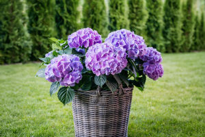
This is probably the most forgiving place to start. Analogous colors sit next to each other on the wheel — think orange, peach, and coral, or pink, soft red, and magenta. The result feels organic and cohesive rather than designed. Pick three or four colors within the same family and vary the saturation: a light, a midtone, and a darker shade. That combination will produce a winning look nearly every time. Most flowers sourced from a grocery store come in the brightest available versions of each color, which can feel artificial. Going analogous with varied tones restores that natural garden quality.
Complementary Colors: Opposite and Bold
Complementary colors sit directly across from each other on the wheel — blue and orange, yellow and violet, red and green. The contrast is strong, almost electric. This scheme works best when used with softer versions of those opposite colors rather than the most saturated extremes. A faded blue delphinium paired with a peachy ranunculus is complementary but feels refined rather than jarring. Heavy contrast with fully saturated versions tends to look dated very quickly. One dominant hue and a restrained accent of the opposite keeps things modern.
Monochromatic: The Quiet Power Move
All variations of a single color — from the palest tint through midtones to deep shades. This is an easy way to achieve a very modern, polished look. A bridal bouquet in ivory, warm cream, and light tan feels quietly luxurious without competing with itself. The key is varying the depth and texture within that one color rather than defaulting to all-white or all-pink uniformity.
Neutrals Are Your Best Friend
Whatever scheme is chosen, neutrals — green foliage, white blooms, soft brown seedpods, silver-grey dusty miller — do essential work. They separate colors that might clash, add breathing room to a busy palette, and give the eye somewhere to rest. Eighty percent of most successful designs lean heavily on neutrals to keep the featured colors from overwhelming each other. When a color combination is correct but the arrangement still looks loud, the fix is almost always adding more neutral foliage or moving to a softer version of the existing tones.
A Few Common Mistakes Worth Avoiding
Overpowering contrast — a strong red against stark white — tends to feel stiff and old-fashioned. Red roses with pink waxflower is more interesting and still very romantic. Ignoring the focal flower is another common slip: every arrangement has a star, and the other colors should support it rather than compete. And color doesn't exist in isolation from the occasion — bright, contrasting combinations read as joyful and celebratory, while muted and subtle palettes feel quieter and more serious. Knowing the mood first makes every color decision easier.
Color is what transforms a collection of flowers into a cohesive arrangement with mood, balance, and personality. By understanding simple principles like analogous harmony, complementary contrast, monochromatic layering, and the role of neutrals, floral design becomes far less intimidating and much more intentional. The most successful arrangements are not always the brightest or most complex—they are the ones where colors work together naturally and support the feeling you want to create. With a basic understanding of color relationships, anyone can build floral combinations that feel balanced, expressive, and visually memorable.