Color does something to people before they're even aware of it.
Walk into a room filled with deep red blooms and something shifts — there's an undeniable charge to the air, a sense of intensity and urgency.
Walk into a space filled with soft lavender and pale blue hydrangeas and the effect is almost the opposite: shoulders drop, breathing slows.
Flowers are one of the most immediate and accessible ways to use color's emotional power, and understanding how that works makes every design decision more intentional.
Warm Colors Energize and Stimulate
Reds, oranges, and rich yellows sit on the warm side of the color wheel, and they behave accordingly in any space they occupy. Red is the most psychologically intense — it's associated with passion, love, energy, and urgency. It raises the heart rate and demands attention, which is why it works so powerfully in romantic arrangements but can feel overwhelming if overused in spaces meant for calm. Orange carries similar energy with slightly less intensity: it's cheerful, social, and inviting. Bright yellow stirs up bubbly, optimistic feelings — it's genuinely hard to feel gloomy standing in front of sunflowers, which is part of why they're so consistently popular for celebrations and gifts. These warm-toned arrangements naturally suit events where engagement and high energy are the point: celebrations, weddings, festive gatherings.
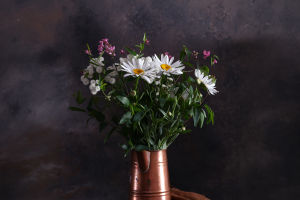
Cool Colors Calm and Restore
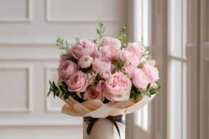
Blues, greens, and purples bring a completely different register. Blue is strongly associated with calm and serenity — blue and white combinations in floral design specifically invoke feelings of peace and tranquility. Soft blues and lavenders lower the emotional temperature of a space and make it feel more restful. Green, perhaps because of its deep association with nature, creates feelings of balance and harmony — it's restorative rather than stimulating, which is why incorporating greenery heavily into an arrangement immediately changes its character even without changing the flowers. Purple occupies interesting psychological territory: lighter lavender tones feel relaxing and reflective, while deeper plums and violets feel luxurious and creative.
How Saturation Shifts the Feeling
It's not just the hue that matters — how saturated or muted a color is changes its emotional effect significantly. Highly saturated, pure colors are intense and immediate. They create excitement, energy, and sometimes visual tension. Muted, dusty, or grayed-down versions of the same hues feel entirely different: more sophisticated, quieter, easier to live with. A bouquet of vivid magenta dahlias delivers impact and excitement. The same dahlias in a dusty rose or antique mauve tone creates something romantic and understated instead. Designing with different levels of saturation within the same palette — rather than using all bright or all muted — creates arrangements that feel layered and nuanced rather than one-note.
Mood Matches the Occasion
Experienced florists think about the emotional goal of an arrangement before selecting the first stem. A sympathy arrangement needs colors that feel quiet, comforting, and gentle — soft whites, pale greens, muted lavenders — rather than anything that reads as celebratory. A birthday arrangement benefits from the energy and joy that warm, bright tones create. A corporate setting usually calls for something clean and neutral that reads as professional and polished without demanding emotional attention. A wedding's palette should reflect not just the couple's aesthetic preferences but the emotional atmosphere they want guests to feel: romantic, joyful, serene, or festive.
Neutrals Have Emotional Weight Too
White, cream, and soft green aren't neutral in terms of emotional effect — they're actively calming. White reads as pure, peaceful, and uncluttered. Arrangements that lean heavily into white and green tend to feel almost spa-like in their clarity. They give the eye somewhere to rest between stronger elements, and they provide balance when bolder colors might otherwise feel aggressive. Rather than thinking of greenery and white blooms as background elements, considering them active emotional contributors to the design changes how and when they get used.
Understanding the emotional language of color allows floral arrangements to become more than decoration — they become part of the atmosphere people feel the moment they enter a space.